Politics4All 🗳
Role: Brand Designer and UX Designer, including: researching, conducting usability studies, wireframing and prototyping.
![]()
Summary
Politics4All is a platform that helps people understand local politics and elections in a digested, easy way. The primary target includes first-generation immigrants, new US citizens, and people who need an easier understanding of local politics.
Role: Brand Designer and UX Designer, including: researching, conducting usability studies, wireframing and prototyping.

Summary
Politics4All is a platform that helps people understand local politics and elections in a digested, easy way. The primary target includes first-generation immigrants, new US citizens, and people who need an easier understanding of local politics.
The problem
Almost 40% of Texans don’t vote, a large part of them is because they don’t know how politics work or don’t know the offices up for election
The goal
To Design a product that will improve education on local politics and help people make informed decisions when voting, especially first-time voters or new US citizens.
Personas
🙋🏾♂️
Luis Ramirez, 20, San Antonio, TX
Luis Ramirez is a Sales administrator in San Antonio, he doesn’t really know a lot about politics since he is a first-generation American and his parents are not really involved with politics, he is excited about voting so he wants to have a full understanding of the offices running in his city and county.
🙋🏻♀️
Xing Chen, 36, Austin, TX
Xing is a Project manager in Austin who just became a US citizen, she wants to really understand US politics, especially in her community, so when the time comes she can vote for someone who represents her views and values in the best way possible.
Ideation
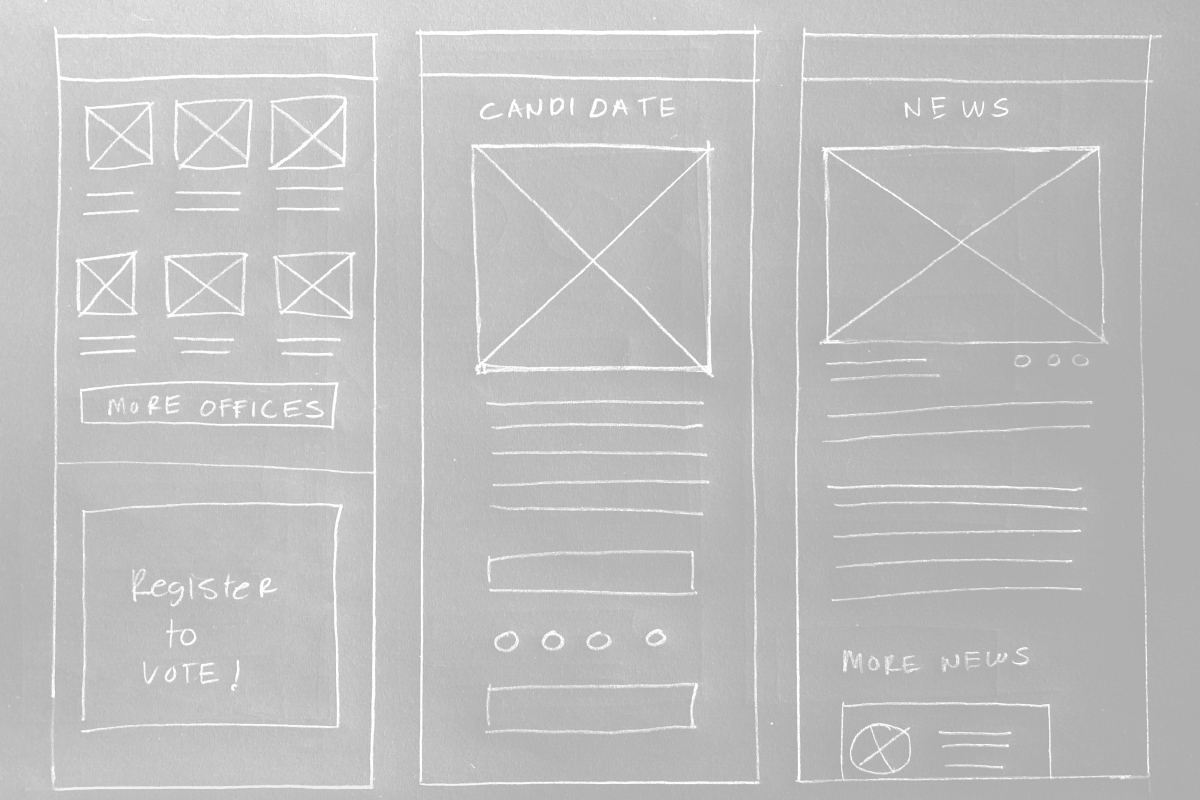
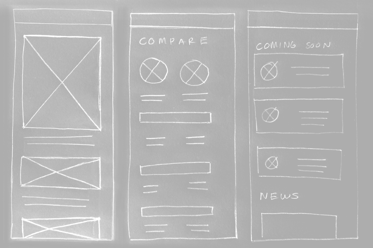
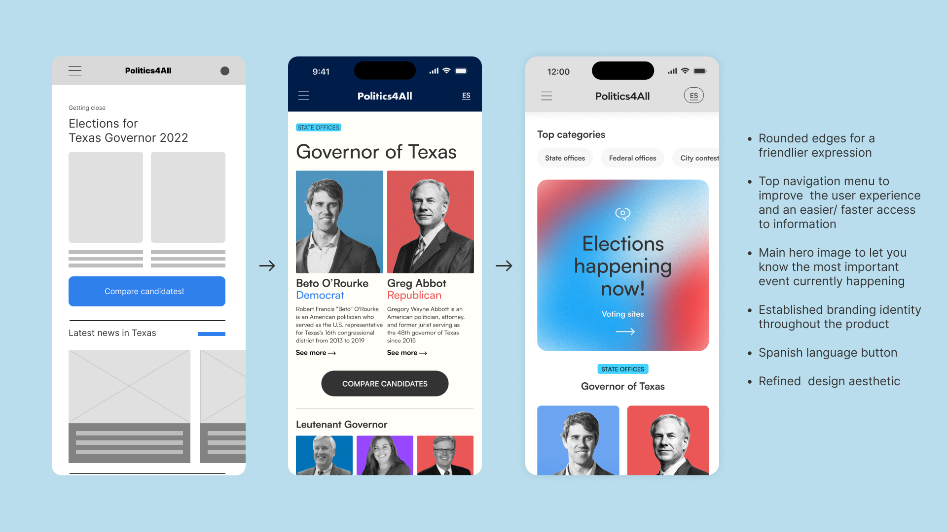
I used an affinity map to identify the general scope for the project and set the right direction and then started to create some lo-fi wireframes This brainstorming was really helpful for the foundation and sections on the product.
Usability study
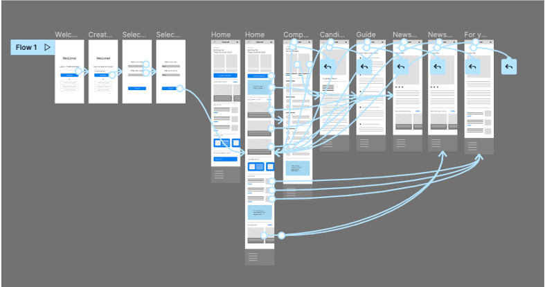
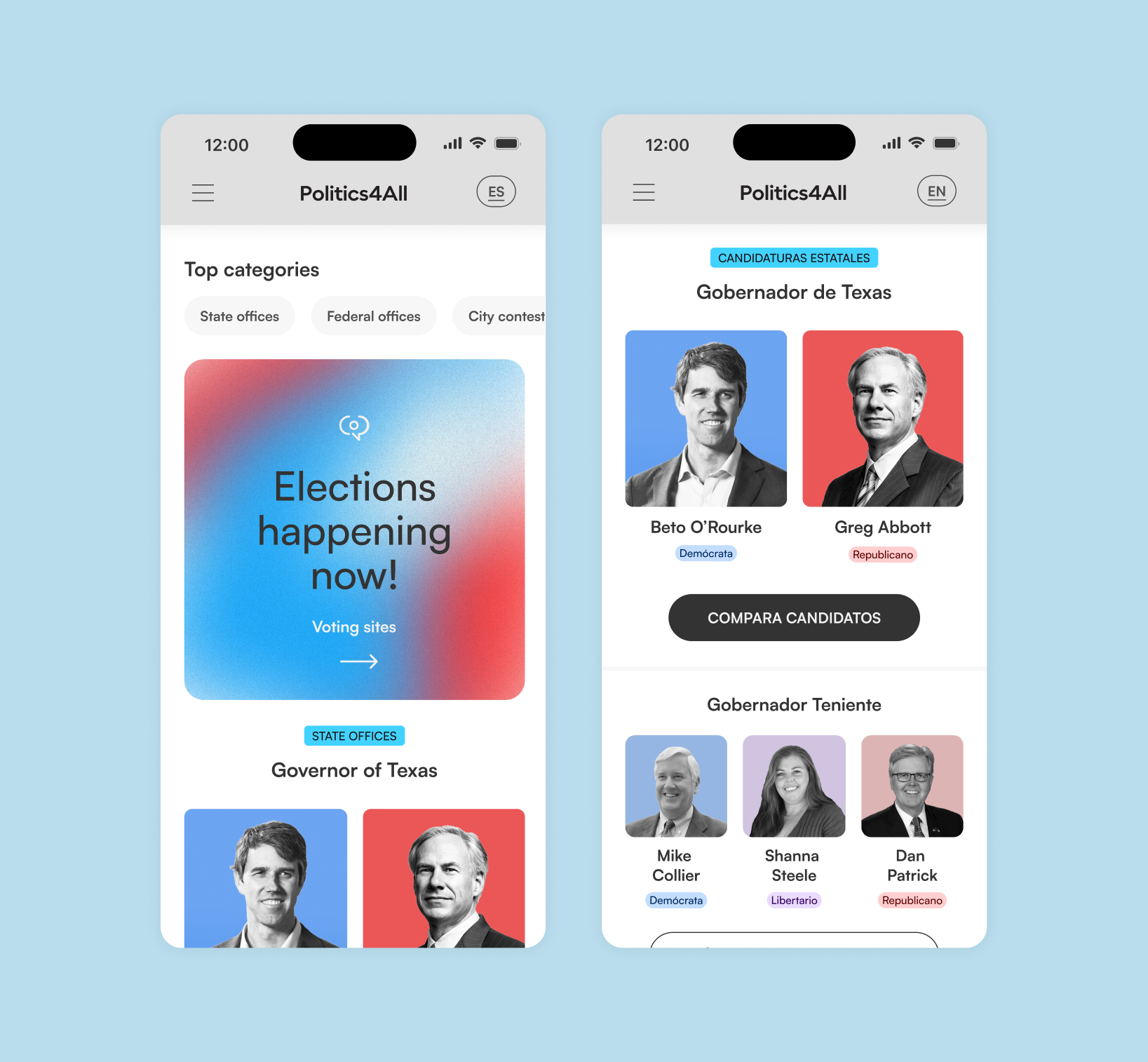
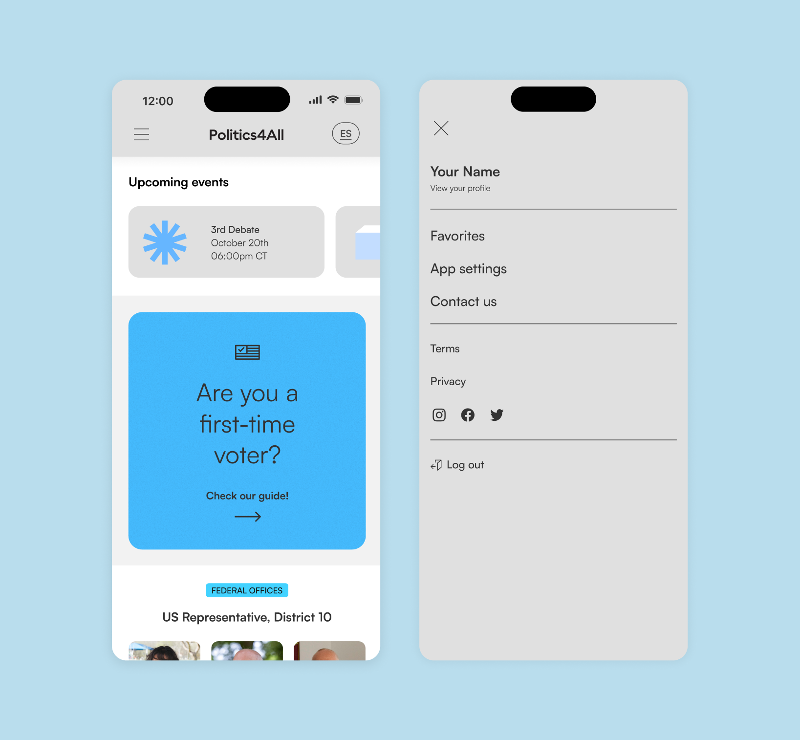
To prepare for usability testing, I created digital wireframes and a low-fidelity prototype that connected the user flow for viewing different topics and navigating the information, I tested it with 5 participants in an unmoderated remote usability study, where a few ideas came to the surface, like adding a Spanish button since a lot of immigrants speak Spanish as the first language, or relevant dates to add to your calendar and set a reminder.
Hands on design
Based on the insights from the usability study, I applied some visual design changes, like providing a clear section from the home screen to browse the most relevant candidates and the different offices up for election, I did a second usability study and the top categories navigation section was added.
Final Design
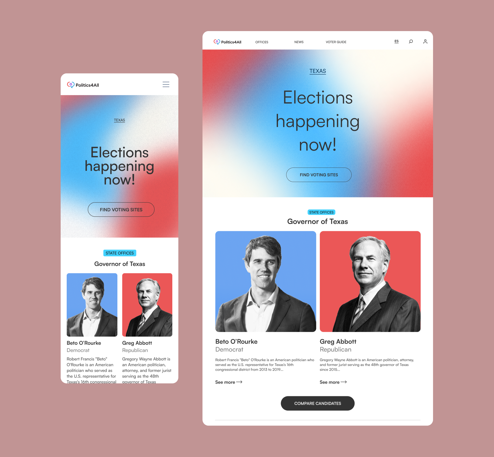
In the final design and hi-fi prototype, a good interaction of branding and usability is conceived, with clear access to information and topics.



Responsive Design
Following the previous principles, a responsive web was created as well, to have complete coverage of access.
