︎
Work
Hey!︎︎︎
About me
Work
Hey!︎︎︎
About me
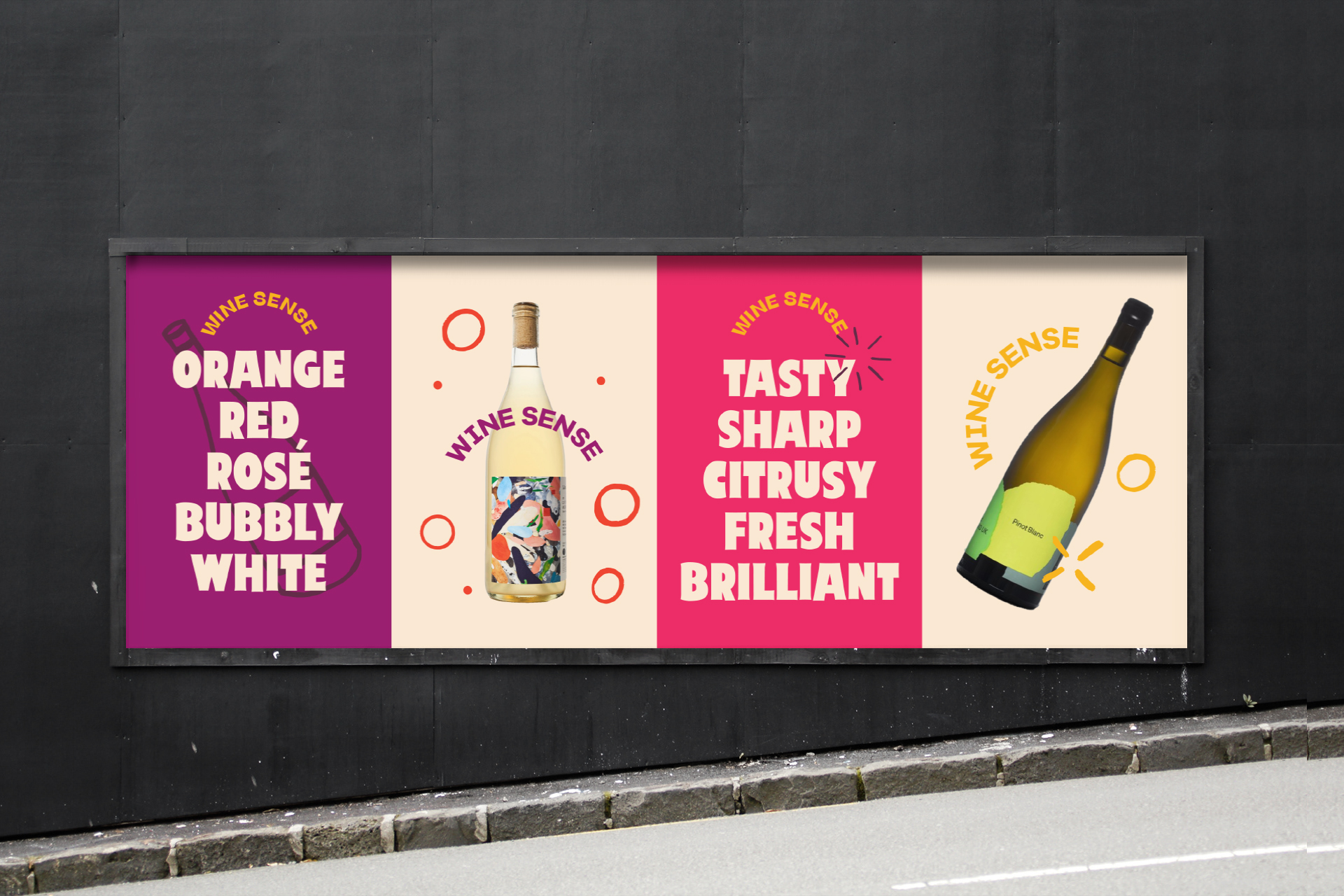
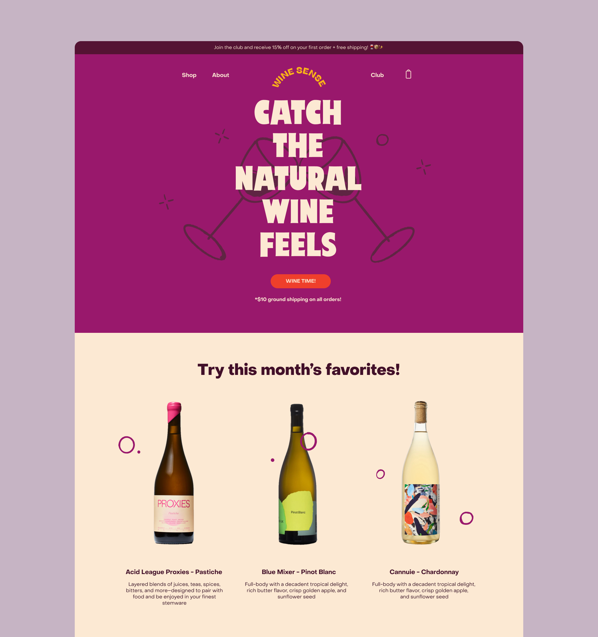
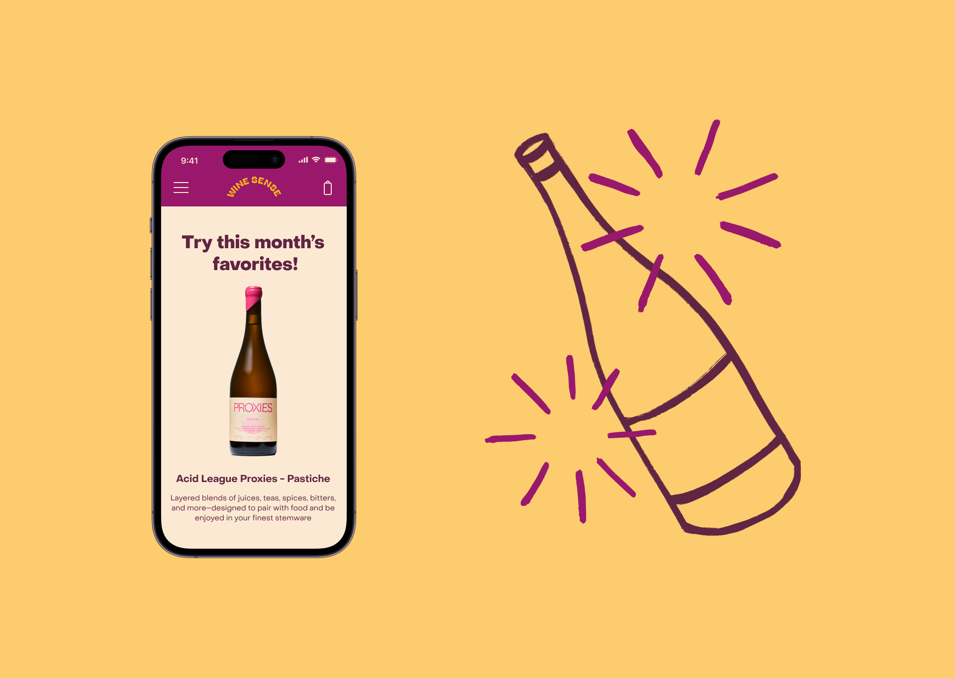
Wine Sense
🍷
TO SEE MORE,
SAY HELLO
︎
/
︎